
New Global Covid 19 Dashboard and data visualization tool
Aug 3, 2020

Power to create your own charts and filters and zoom in on a chloropleth Google Map at Country, State and County level
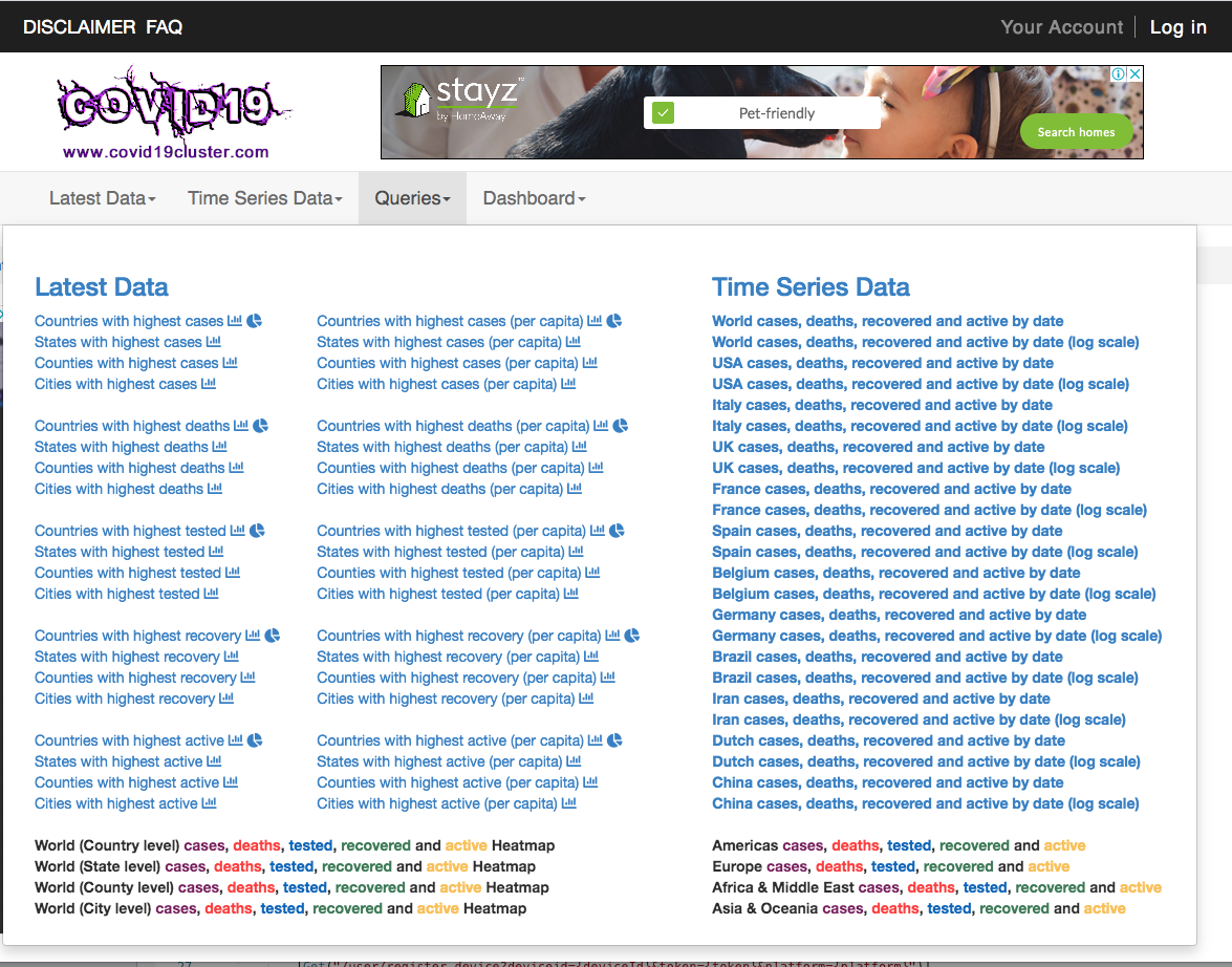
New York City, Aug 2, 2020 (Issuewire.com) - Release of a new dashboard www.covid19cluster.com containing COVID-19 data sourced from Government websites around the world. The site allows you to visualize Covid19 metrics in a variety of charts that can be filtered and searched by various parameters including by distance if you input your location. The dashboard compares geographic regions based on a selected metric on a chloropleth Google Map which may be zoomed and panned to restrict the comparison. The filter includes Draw-a-search functionality to select/lasso specific geographic areas including complex polygons. The site has a drop-down menu containing a number of pre-built queries and you can save your searches and re-use them across devices if you register.Charts can be embedded within your website - build your own dashboard!



Media Contact
Paul
Source :covid19cluster.com
This article was originally published by IssueWire. Read the original article here.
More News












YOUR NEWS, OUR NETWORK.
Do you have Great News you want to tell the world?
Be it updates about your business or your community, you can make sure that it’s heard by submitting your story to our network reaching hundreds of news sites across 6 verticals.